
Taylor Swift – Reputation

Album cover. Photography by Mert Alas and Marcus Piggott
“I’m sorry, but the old Taylor can’t come to the phone right now. Why? Oh, ’cause she’s dead.”
So ends single Look What You Made Me Do, the first to come out of pop queen Taylor Swift’s 2017 album Reputation. In keeping with these times of constant rebranding, the image of former Myspace moonshot has been retweaked into something far more edgy, urban and contemporary.
As with the release of Kendrick Lamar’s DAMN. earlier the same, it was the cover more than anything that sparked great internet reaction. Opinion seemed to have been split by those proclaiming horror by the “trend of bad design”, while others fell in claims of Swift ripping Kanye West.
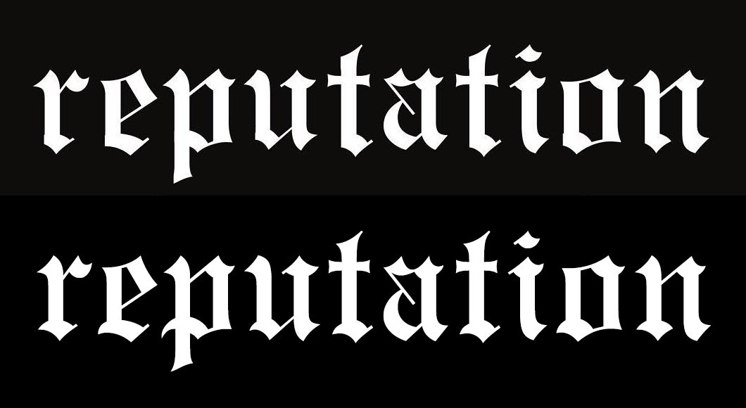
Top: the original title artwork as posted by Taylor Swift to Instagram. Bottom: Engravers’ Old English BT
The title is in a slightly modified Engravers’ Old English, with the left parts of the base strokes (sloppily) clipped. This typeface was probably chosen to resemble the logos of newspapers and more specifically that of The New York Times, most recently redrawn by Matthew Carter for the 2015 relaunch.
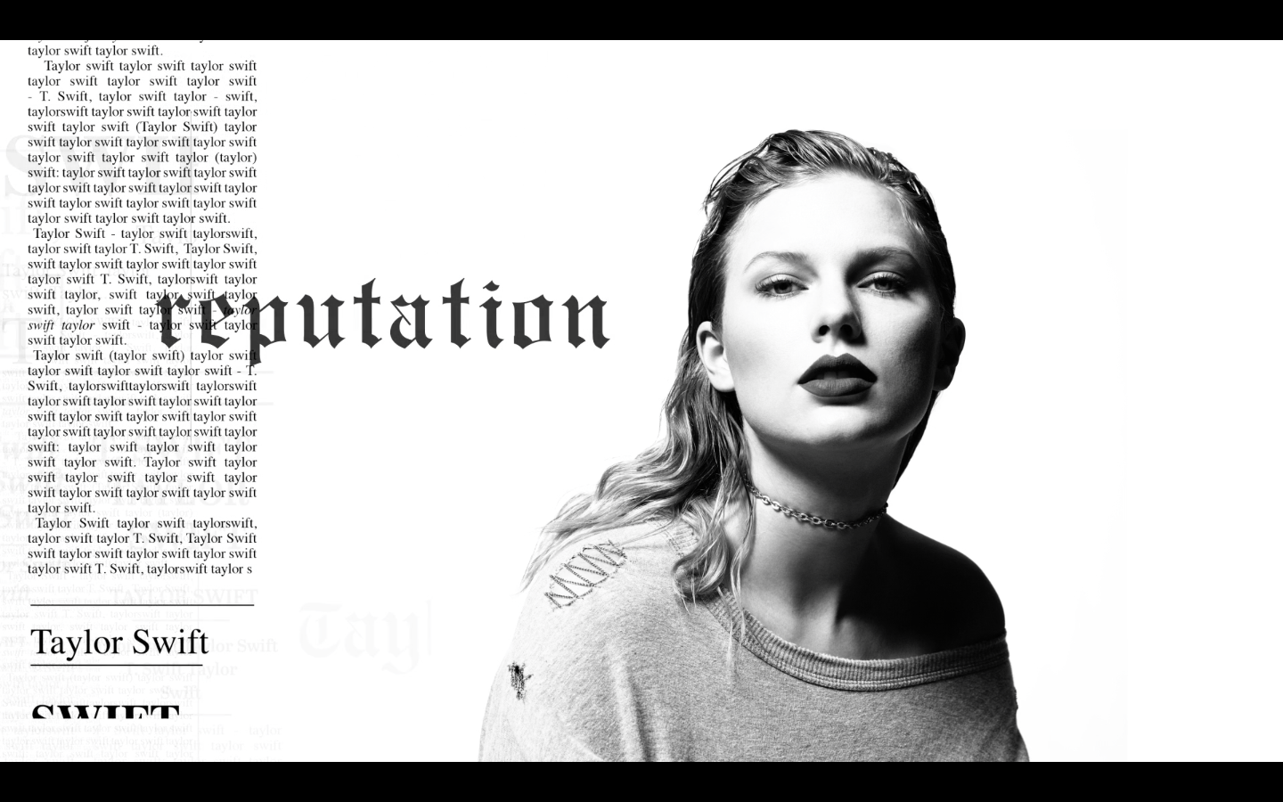
Stills from the animation on Taylor Swift’s website
Consider it aesthetically pleasing or not, it does spotlight many of the current trends in graphic design: repetition, use of system fonts and general typographic irony framed in a layered newsclip composition. It all makes a bit more sense when seen in an animated version on her official website, which feature anti-design favorite Times New Roman far more prominently. This clip also includes some Cheltenham and Franklin Gothic – two typefaces that both play a major role in the visual identity of The New York Times, next to Abril Text, a typeface which has been employed for various newspapers.
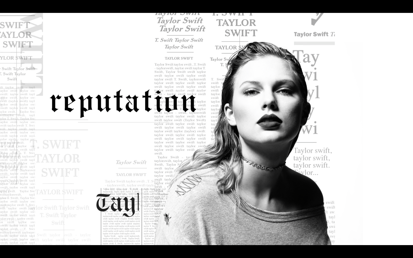


Animated clips announcing the single Look What You Made Me Do, again using a customized Engravers’ Old English. The hairline strokes texturing the capitals as well as the dangling descender in ‘h’ have been eliminated. ‘Y’ was given a completely new, romanized form, which comes remarkably close to the ‘Y’ found in Nemek Gothic, one the fonts modeled after the same iron-on gothic letters as seen in the “I Feel Like Pablo” merch designed by Joe Perez & Mark Seekings for Donda/Kanye West, based on original artwork by Cali Thornhill DeWitt AKA Caramel Bobby.

The seriffed caps that appear in the announcement graphics are from Kepler Display Semicondensed.


")


")


 and <cite>Surprise Surprise</cite> (1982)")


")


