1972 U.S. election, CBS News
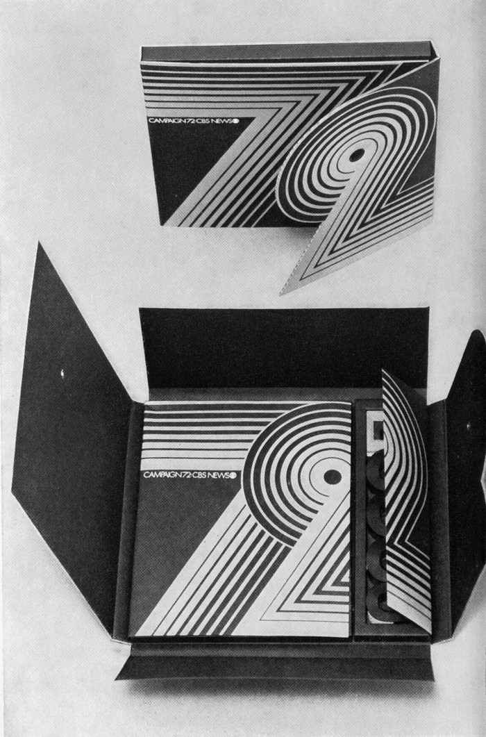
Folding cardboard box containing material on the 1972 election campaign, blue, red, and black. Design by Akihiko Seki for CBS/Broadcast Group. Reproduced in Graphis #168, March 1974.
The graphic identity of CBS’s coverage of the 1972 U.S. election campaign may be the original application of Aki Lines, or at least an early use by its designer, Akihiko Seki.
The iconic multiline typeface is probably best known for its use in the original Microsoft logo. While the design date of Aki Lines is often given as 1970, I haven’t found any evidence that it was generally available before 1973. It appears in an ITC ad from July 1973. Photo-Lettering (the company that produced many of ITC’s predigital fonts) included Aki Lines in their Advance Showing #20 from 1973. Mecanorma announced their adaptation for dry-transfer lettering for October 1973, and Chartpak’s version was patented in that year, too.
On Daylight Fonts, Shin Oka mentions an article about Akihiko Seki in IDEA magazine No. 141 from 1977. There, Seki is portrayed as a graphic designer who was active in New York at that time. From 1970 on, he worked for Lou Dorfsman of CBS for more than six years. It seems likely that Aki Lines evolved from design work that Seki did at CBS, and was subsequently picked up by ITC. The earliest Use of Aki Lines that we had documented on Fonts In Use so far is from 1973 – it’s the NBA intros by CBS.

For comparison, a setting in Aki Lines. The glyphs are made from seven lines. In the 7, the weight gradient runs in the opposite direction from the glyph in the CBS graphics.
The overlapping numerals “72” appear on the kit shown above as well as in the animated title sequence for the CBS News live coverage of Election Night ’72 hosted by Walter Cronkite. They feature multiple lines of increasing stroke width, just like Aki Lines. While they have eight lines, the typeface has seven. I’d assume that the pattern was slightly simplified once it had to be applied to a full character set. So maybe this isn’t Aki Lines yet, but a prototype. If you happen to know more about Akihiko Seki and his Aki Lines, I’d love to hear about it.
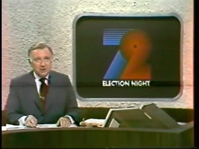
Walter Cronkite live on CBS News, November 7, 1972.

Still from an animated sequence. “Election ’72” is in caps from Futura Bold.
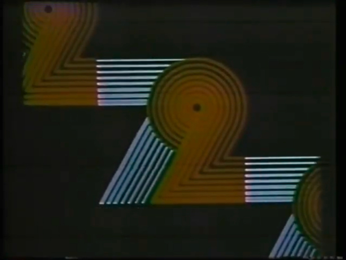
The numerals are repeated and join into a pattern of red and blue lines.
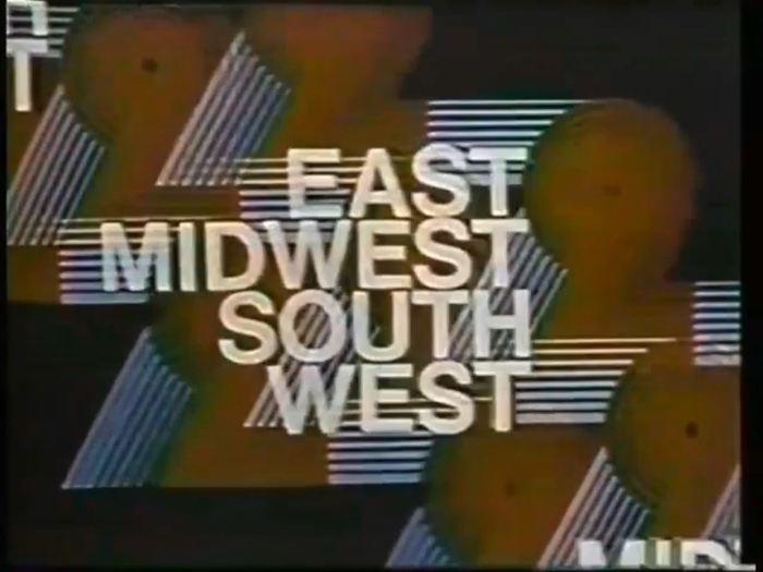
Other text elements are shown on top …
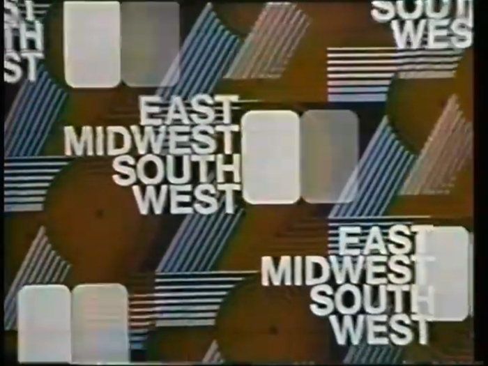
… in white caps from Helvetica Bold.
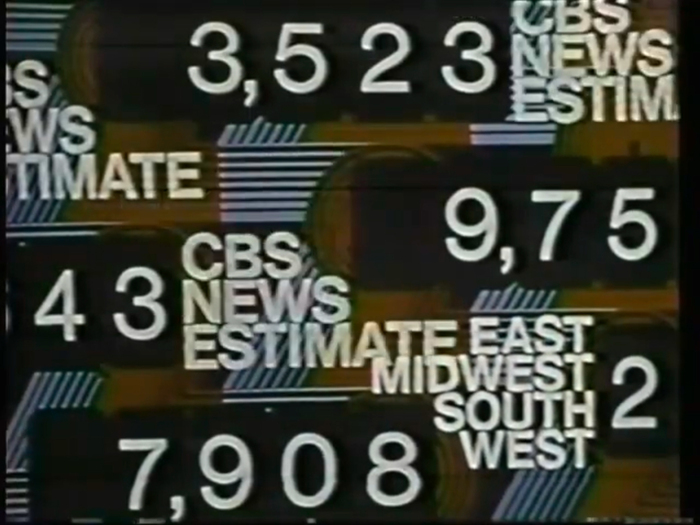
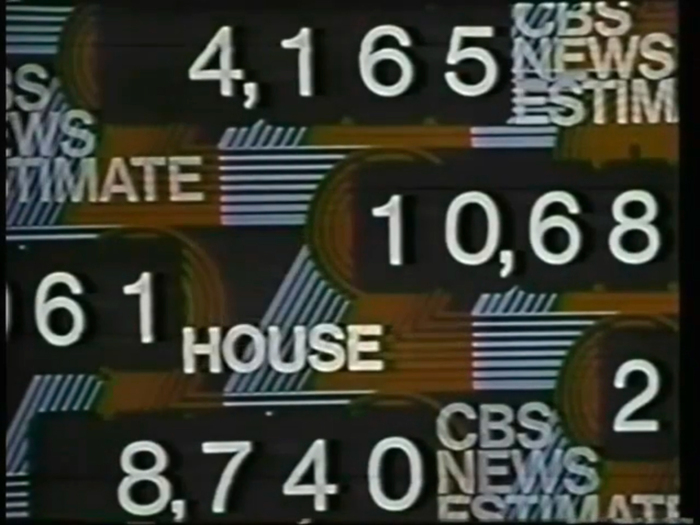
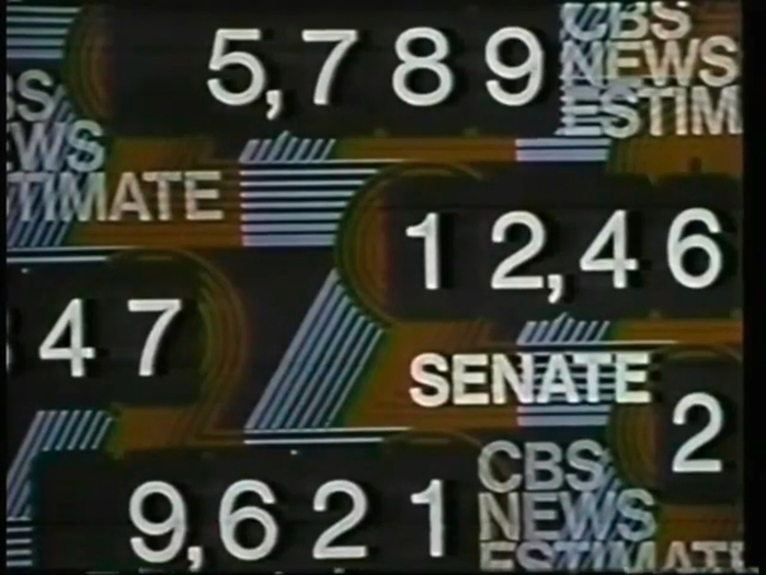


The weight of the lines progress from thin (top) to thick (bottom) in the horizontal parts of both the 7 and the 2. This is different from the glyphs in the final typeface, but allows for a seamless pattern.
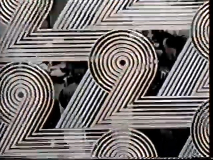
The multiline pattern is blown up and fades out, opening the view to the CBS News studio.
Formats
- Packaging (1985)
- Film/Video (869)
Designers/Agencies
- Akihiko Seki (1)
- CBS (4)
- Lou Dorfsman (5)
Tagged with
- first use (358)
- uses by the typeface’s designer (1019)
- multiline (126)
- numerals (905)
- CBS (28)
- broadcasting (69)
- US presidential campaigns (39)
- 1970s (1355)
- red and blue (316)
- overlap (305)
- animated type (319)
- animation (280)
- type as pattern/ornament (172)
- repetition (683)
- all caps (5979)
- boxes (409)
- cardboard (117)
- Walter Cronkite (1)
- TV graphics (47)
- lettering (539)
- folded (187)
- pre-release uses (462)
- overlayered type (112)
Artwork location
- United States (8318)
- New York City (2338)















5 Comments on “1972 U.S. election, CBS News”
An earlier appearance of the graphic, in the CBS Evening News broadcast from 23 June 1972:
Aki Lines avant les lettres.
I have seen another one use of Aki Lines in 1972 and even in the same case: it was used in the sequence of the Brazilian tv channel Rede Globo. Here’s the video.
Pretty interesting that it shows the normal numeral 7, but the another one is reversed here!
Hi Alex, that’s a wonderful addition, thank you! Just like the CBS graphics, this “72” is made of eight lines, and not seven like the Aki Lines typeface. Considering the nearly identical arrangement, I’m inclined to say that some designer at Rêde Globo watched CBS and really liked their “72”.
In the Communication Arts 73 design annual, the title sequence is included and Lou Dorfsman is also credited as art director.