Haüy’s Essay on the Education of the Blind (1786)
One of the earliest forms of sans serif type ever seen in a book was designed for those who couldn’t see at all.
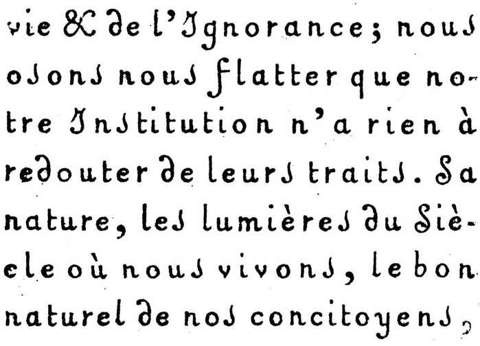
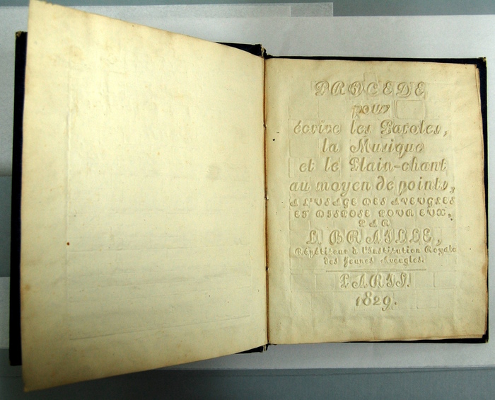
You are looking at one of the first Latin-alphabet sans serif typefaces. Well, sort of. Published in 1786, Valentin Haüy’s Essay on the Education of the Blind (Essai sur l’éducation des aveugles) showcases in the entire main text his project, one of the first attempts to create a Latin-alphabet writing system for the blind. His approach was embossing simplified characters onto paper, which could be lightly inked to allow the sighted to read them also. This comes thirty years before the Caslon capitals-only “Egyptian” of 1816 that celebrates its two-hundredth anniversary this year and is the first sans serif typeface known to have been made for general-purpose audiences.
Haüy’s typeface is extraordinary — rooted in script writing, but with a wide spacing that makes it unmistakably print writing, it uses swashes on almost all the capitals, apparently to make them more distinguishable. It’s been discussed in many other sources, most notably by the great James Mosley, whose comments on the now defunct Typophile and The Nymph and the Grot on it and other early sans serifs are a must-read for anyone interested in where sans serifs come from, and also by Joseph Alessio. But the entire book is available for the casual reader to examine on Google Books now in two independent digitisations.
Aesthetically, to my non-expert eyes, it looks remarkably unlike most anything that would be typeset (as opposed to engraved) in the Latin alphabet for about the next hundred years. What (to me) makes it look very modern is its general delicacy and text-face build (one could mistake it for a FontFont typeface from the 1990s) and the single-storey ‘a’ and ‘g’, making it, in effect, an upright italic. (Of course, script typefaces often have some sans serif characteristics, right back to the first.) Interesting details abound: the flourish on the the ‘d’ (c.f. early chancery italic typefaces), the flamboyant wide ampersand, the ‘i’ and lower-case ‘L’ with curls, the swashed upper-case ‘i’. The ‘s’ is a bit long-s-ish, but there doesn’t seem to be use of a separate long and short ‘s’. It looks forward to the early sans serif italics of the late nineteenth century and ATF’s Announcement Roman, and also looks a bit like modern handwriting-influenced upright faces like Sassoon and Andika, but most of all it’s totally unlike the galumphing sans serif display capitals that would come out of British and then German and American foundries starting around the 1830s. (The confusing swashed capital ‘I’ is not unique: it turns up in some handwriting and blackletter styles and even a few adaptations of Akzidenz-Grotesk.)
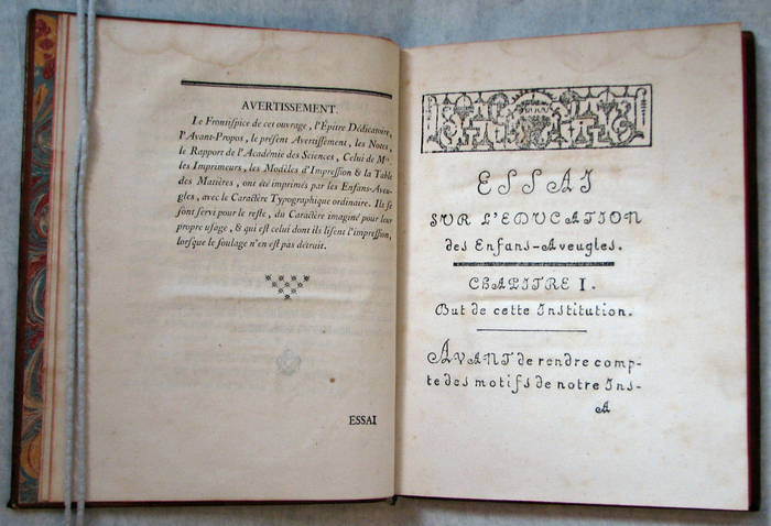
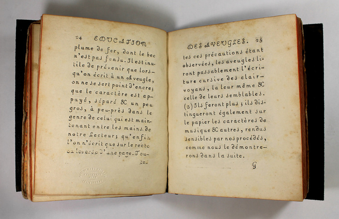
Regarding its printing, the title page notes that it was printed not only for but by blind children in Haüy’s school. Celebrating this achievement, a copy was presented to King Louis XVI on Boxing Day 1786. Haüy describes this printing method from page 30 onwards.
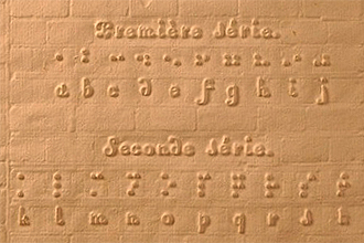
Unfortunately, of course, Haüy’s system with its low information density looks very nice but was pretty rubbish for actual blind people. One of his students, Louis Braille, at the age of just 15 … well, I think you know that story. Although Alastair Johnston’s judgment of the typeface as “illegible, even to sighted readers” seems a bit harsh. Haüy’s letters (or copies) were used for headings on an early 1829 Braille specimen, incidentally, and photographs of this show what it looks like without inking (essentially the same).
The introduction and conclusion sections of the book are printed in conventional typefaces of the 1780s, that seem like early modern (or later old-style?) faces, going by the curled ‘R’ on many fonts.
You can see good photos of a copy of the book here put on sale in 2013 to give a general sense of what it looks like. Or, indeed, for the low price of €6,500, you could have purchased it. A digital revival of Haüy’s typeface can be had for less: In 2006, Harold Lohner created the very cute and quite faithful Valentin.

Harold Lohner’s digital interpretation Valentin (2006), with smoothed, regularized and re-spaced letterforms.
Blythwood is interested in things science, health, transportation, industry, Gill Sans and Monotype. An avid Wikipedia editor, Blythwood’s goal is to improve coverage of fonts and printing there. After having contributed a dozen choice posts to the Fonts In Use Collection, this is the first to appear in the Blog.
Formats
- Books (5435)
Topics
- Institutional (1153)
- Science/Nature (909)
- Education/Academia (1807)
Designers/Agencies
- Valentin Haüy (1)
Tagged with
- literacy (8)
- upright italic (5)
- script (294)
- swashes (583)
- title pages (837)
- book interiors (2891)
- embossed/debossed (497)
- historically significant (25)
- 1700s (3)
- type history (36)
- French (language) (1988)
- tactile (9)
- essays (198)
- catchwords (page breaks) (3)
- blindness / visual impairment
- disabilities (17)



















4 Comments on “Haüy’s Essay on the Education of the Blind (1786)”
Thank you very much for this intriguing article!
You mention that Haüy’s typeface is extraordinary — it certainly is. I wonder how different it is from other French script typefaces of that time, though, apart from the wide spacing and the eliminated contrast. The former was probably introduced for better letter separation. The latter is a consequence of the writing tool and technique — Haüy mentions that in his writing method (which is emulated by his typeface), the lines are made on heavy paper with an iron pen whose nib is not split, without ink. The letters are impressed, separate and a little big, but otherwise not essentially different from the cursive of the sighted (p23f).
Upright scripts known as Ronde have a long tradition in France. They are still used in the classroom, or serve as reference for new typeface designs. Attached below is a detail from a specimen by Gillé from 1808, but the style has certainly be made into type earlier. Gando Ronde by Hans-Jürg Hunziker and Matthew Carter (Mergenthaler, 1970) is based on the work of Nicholas Gando, who was active in the mid 1700s. I’m grateful for any information about earlier typefaces in this style.
Wow, you made it a blog post! Thanks so very much to Florian for editing this and making it look wonderful.
Yes, that is a very good point: it’s inherent in script faces that they will have fewer serifs than a text face, if not none. One can also compare with civilité types. Which makes it a much more “natural” place to start sans-serifs from than the British style of Figgins that dominated by 1840, that seems to have originated by fusing neoclassical Roman capitals with the build and condensation of the fat face to produce a letterform that has no roots in script at all, and indeed really no natural lower-case that can harmonise well with it.
You wouldn’t want to use it for everything, but my own feeling is that this is a style that – perhaps modernised a little – could look really good in many uses today. It’s legible, characterful and different. So that Jean-Baptiste Levée face is also interesting to see for its fusion of cursive and static features.
I should add, by the way, that this embossed lettering formed a diverse range, and from samples I’ve seen the range of letterforms used by Hauy’s institute was expanded over the period of its use. If you look at that 1829 Braille title page, there’s a large face with a strong slant that appears nowhere in the 1786 text, and looks very like a Didot italic with most of the serifs taken off. Typographica (no, not that one, the magazine published in the 1960s) has photos of something similar but not quite identical (different capital ‘M’) in an 1819 text on issue 6 p. 3, which has been digitised. And there were several other versions of this embossed lettering in use in different countries in the early nineteenth century. If you’re a font designer, I absolutely think you could find a lot of inspiration for a blockbuster multi-weight family if you do a little research. Maybe Mr. Lohner would consider expanding the family, say adding a boldface, lining figures and some alternate non-swash caps and small caps?
Sorry, that should read “fusing neoclassical Roman capitals with the build of the fat face and adding condensation” – fat faces generally aren’t particularly condensed!
Incidentally, as a personal comment, one topic that I have not really seen in discussion of early sans-serif letterforms that are not written is needlepoint samplers, on which it is easiest to fit a monoline letterform onto the grid structure imposed by the substrate cloth. Many of these – this one, say from 1760, and there are surely many more like it – have some kind of limited number of serifs, and indeed this also has in contrast ornamented capitals of the kind that mostly do not appear in printing just yet. But this is not something I can say much about, and I don’t know who has written about this.
On that topic too (since it’s beautiful and little-known), here’s a text written by a future queen of England (then eleven) in 1544. This is a source that sans-serif letterforms in mass-market printing easily could have come from, but didn’t.
More images of embossed printing: